For this task, I decided to narrow down my choice to comics because that is what I am more interested in.
For this weeks task, I decided to use a page from one of Frank Miller’s Batman comics that I found online. I wanted to use this image because it helps to portray a common use of blue in comics to represent cities and one of my favourite parts of writing is creating bustling cities.
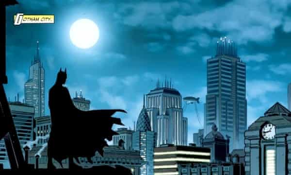
In my first image I used ‘OCR A Extended’ because it has a very technological design to it with it’s ridged edges and blocky feel. I used the eye dropper tool in Illustrator to get samples of the blues so that I could use the text to represent the city. It gets brighter as the text moves towards the I because I used the I to represent the moon and how the moon is the only pure source of light in these cities and everything else is lit artificially, be that from streetlights, buildings or cars.

In my second image, I did not change a lot besides from changing the C to a much darker colour. This is to reflect how a lot of comic book artists, like Frank Miller, will use darker and harsher colours to break the characters away from the city so that the characters are the focal point and to stop them from just blending into the scenery.

Overall, I believe I captured the essence of comic books and Frank Miller’s style of comic book art, quite well in my text.
I mentioned in a former post that I decided to use ‘OCR A Extended’ because it has a Neo-Dystopian feel to it. I believe that the Neo-Dystopian effect of the text also applies in the post because the Batman comics are quite regularly set in a Neo-Dystopian Gotham City.