For this task, I decided to create one of the most iconic pieces of a superheroes ensemble, their brand/logo by drawing inspiration from two of my favourite superhero logos.
The above logo is from the animated TV series ‘Batman Beyond’ (1999). I watched the show when I was a kid and it was one of the TV shows that acted as my gateway into comics.
I decided to draw inspiration from this logo because Batman is one of the most recognisable logos and the sharpness of the logo is very pleasing to me. My other favourite batman logos (The Arkham Game Series and The Dark Knight Series) also heavily resemble the Batman Beyond logo.
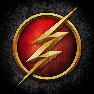
The second logo I drew inspiration from The Flash (2014) TV Show. The logo itself draws inspiration from the Barry Allen era Flash logo.
I personally like the logo because of its metallic look. The sharp points of the Flash symbol also play well with the sharpness of the Batman Beyond logo.
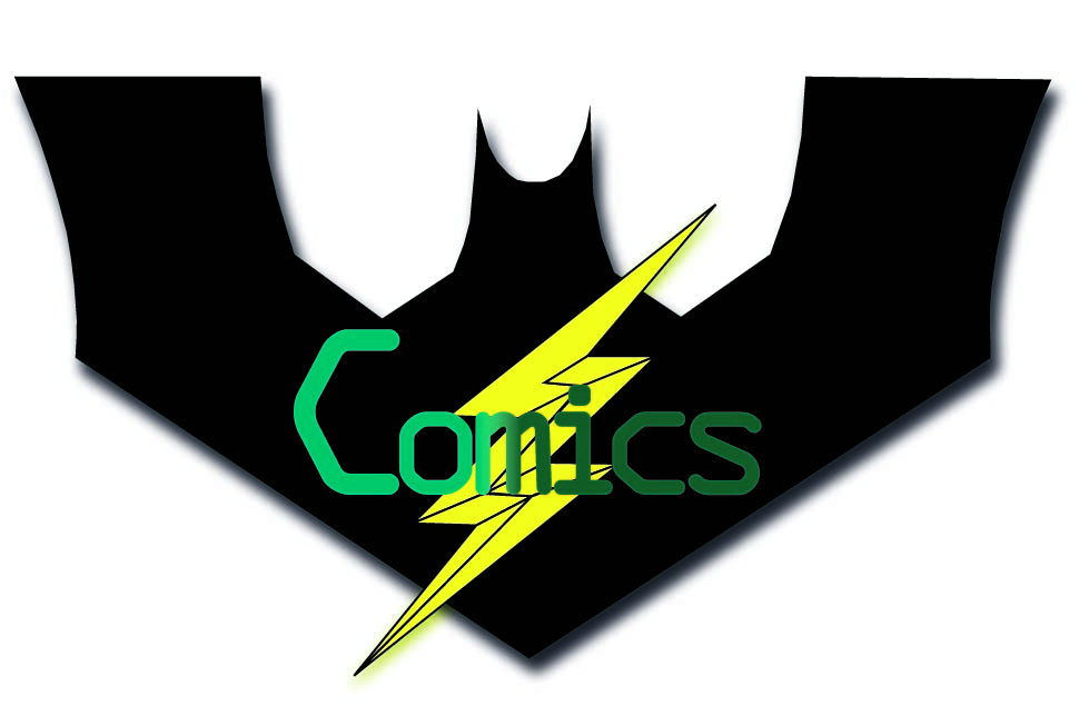
This is my final piece. I used the pen tool for the outlines of the pieces. You can see where the inspiration from the Batman Beyond and The Flash logos. I added a drop shadow to both layers of the logo to add a sense of depth to the logo and helps it to feel like it is protruding out of a costume.
I used ‘OCR A Extended’ for the text and the text is a copy of my work from last week. I used a gradient on the text to match with the drop shadow on the logo. I also used the PANTONE Solid Coated palette for both shades of green. I decided to use a gradient for the text instead of a drop shadow to make it seem like it was more like a title for the work rather than part of the logo itself.