I decided that I wanted to create two simple logos. I decided on two because of my influences being closely related to one another.
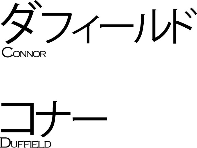
I decided to format my first piece in the way that I did because it matches to a lot of ‘Slice of Life’ anime. Slice of Life is a genre of anime that closely mimics real life, so there are no superpowers or unrealistic plots. (Lucky Star is an example of a Slice of Life anime).
Adobe Illustrator does not have a native inclusion of Japenese symbols (Kanji, Hiragana and Katakana) so I used Google Translate. I just typed my name into Google Translate and then checked it against an online Japenese dictionary to make sure it was accurate and then pasted it into Illustrator and formatted it.
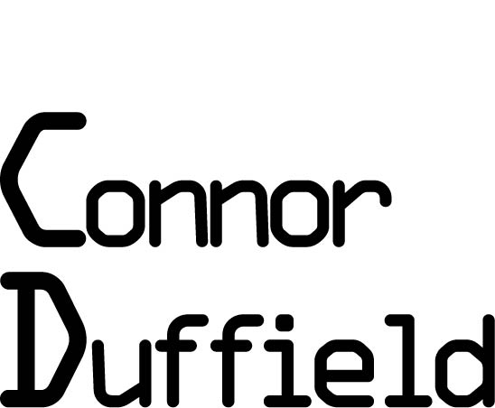
For my second piece, I used OCR A Extended because it gives me a technological feel and neo-dystopian comics are one of my favourite genres of comic and a convention of that genre is technology.
The sharp corners and more blocky curves are what gave me the confidence to use OCR A Extended because it follows the dystopian conventions.
The inspiration to follow the path of formatting my name in a Neo-Dystopian style comes from the Tron comics.
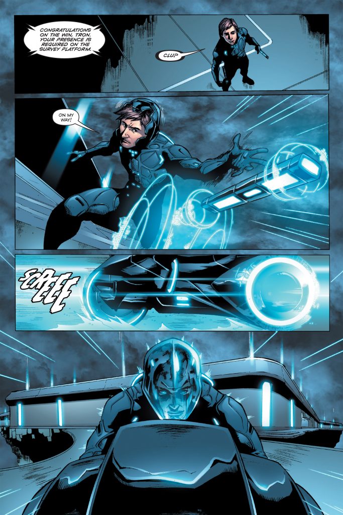
Throughout the different issues of the TRON comics, the architecture takes on a Neo-Dystopian style. The Neo-Dystopian style is characterized by a lot of neon lights, sharp corners, glossy materials and normally is related to a part collapse in society to which the architecture acts as a contradiction because the buildings normally look sleek and clean.
I tried to capture the Neo-Dystopian style by using TRON as an example when formatting my text..