For this weeks task, I slight moved my subject focus from just comics and towards comic book movie adaptations. I choose to shift my focus for this task because comic books have very little marketing for them in the modern age so I feel I could not form a sufficient blog post from it.

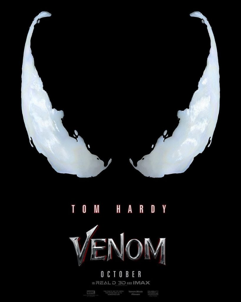
The Venom (2018) poster uses very simple, clean visuals. The simplistic design of the poster matches to the target audience because Venom is such a staple mark character in Marvel Comics.
The main design of the poster features Venom’s eyes. The use of Venom’s eyes by the designers is smart because the comics also used Venom’s eyes to indicate when he was going to be a focal point in an issue so the poster mimics the cover of a comic book by using their eyes to show that Venom is the main character in the movie.

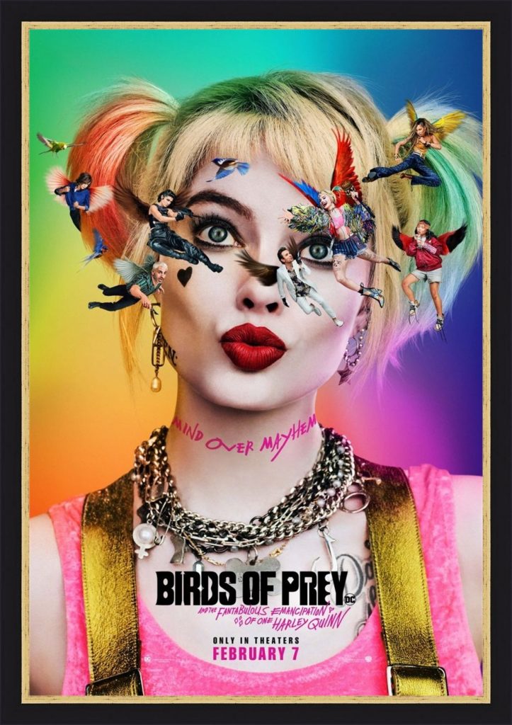
For my second analysis, I decided to use the Birds of Prey (2020) movie poster. The poster for Birds of Prey tackles the movie audience and comic audience as separate audiences, rather than treating them as the same audience, but they use the same aspect to address them, the characters.
The movie audience is addressed through the use of characters on the poster. The poster displays the characters floating around Harley’s head. The use of the characters in this way helps to portray Harley’s mental instability to the audience.
The comic audience is addressed through the use of characters on the poster as well. The classic Birds of Prey in the comics are not the same as the Birds of Prey in the movie. The classic Birds of Prey being Oracle, Huntress and Black Canary. The use of the characters on the poster helps to show that the comic audience can expect the newer Birds of Prey and the craziness that Harley Quinn carries with her.