Categories
Presentation Campaign Graphic

Purpose and Audience

For this weeks task, I slight moved my subject focus from just comics and towards comic book movie adaptations. I choose to shift my focus for this task because comic books have very little marketing for them in the modern age so I feel I could not form a sufficient blog post from it.

https://bit.ly/2KihQzd

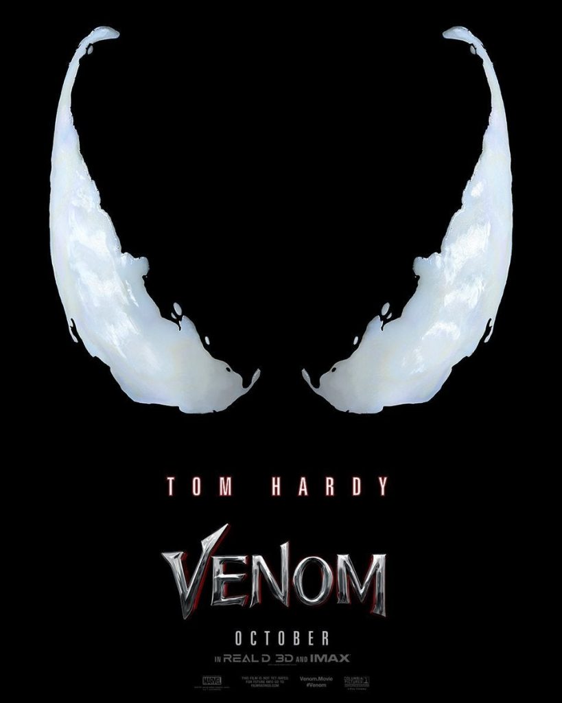
The Venom (2018) poster uses very simple, clean visuals. The simplistic design of the poster matches to the target audience because Venom is such a staple mark character in Marvel Comics.

The main design of the poster features Venom’s eyes. The use of Venom’s eyes by the designers is smart because the comics also used Venom’s eyes to indicate when he was going to be a focal point in an issue so the poster mimics the cover of a comic book by using their eyes to show that Venom is the main character in the movie.

https://bit.ly/32PAkO0

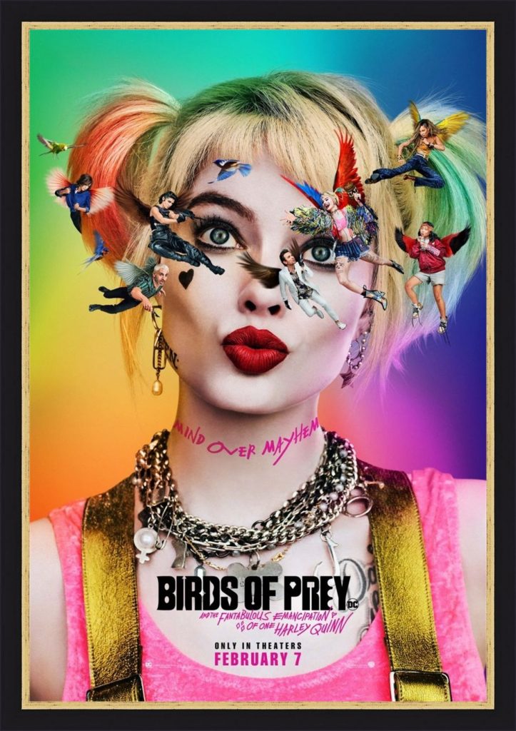
For my second analysis, I decided to use the Birds of Prey (2020) movie poster. The poster for Birds of Prey tackles the movie audience and comic audience as separate audiences, rather than treating them as the same audience, but they use the same aspect to address them, the characters.

The movie audience is addressed through the use of characters on the poster. The poster displays the characters floating around Harley’s head. The use of the characters in this way helps to portray Harley’s mental instability to the audience.

The comic audience is addressed through the use of characters on the poster as well. The classic Birds of Prey in the comics are not the same as the Birds of Prey in the movie. The classic Birds of Prey being Oracle, Huntress and Black Canary. The use of the characters on the poster helps to show that the comic audience can expect the newer Birds of Prey and the craziness that Harley Quinn carries with her.

Categories
Presentation Campaign Graphic

Designing With Shapes

For this task, I decided to create one of the most iconic pieces of a superheroes ensemble, their brand/logo by drawing inspiration from two of my favourite superhero logos.

https://bit.ly/3jABRNr

The above logo is from the animated TV series ‘Batman Beyond’ (1999). I watched the show when I was a kid and it was one of the TV shows that acted as my gateway into comics.

I decided to draw inspiration from this logo because Batman is one of the most recognisable logos and the sharpness of the logo is very pleasing to me. My other favourite batman logos (The Arkham Game Series and The Dark Knight Series) also heavily resemble the Batman Beyond logo.

https://bit.ly/2TwQ57i

The second logo I drew inspiration from The Flash (2014) TV Show. The logo itself draws inspiration from the Barry Allen era Flash logo.

I personally like the logo because of its metallic look. The sharp points of the Flash symbol also play well with the sharpness of the Batman Beyond logo.

This is my final piece. I used the pen tool for the outlines of the pieces. You can see where the inspiration from the Batman Beyond and The Flash logos. I added a drop shadow to both layers of the logo to add a sense of depth to the logo and helps it to feel like it is protruding out of a costume.

I used ‘OCR A Extended’ for the text and the text is a copy of my work from last week. I used a gradient on the text to match with the drop shadow on the logo. I also used the PANTONE Solid Coated palette for both shades of green. I decided to use a gradient for the text instead of a drop shadow to make it seem like it was more like a title for the work rather than part of the logo itself.

Categories
Presentation Campaign Graphic

Colour

For this task, I decided to narrow down my choice to comics because that is what I am more interested in.

For this weeks task, I decided to use a page from one of Frank Miller’s Batman comics that I found online. I wanted to use this image because it helps to portray a common use of blue in comics to represent cities and one of my favourite parts of writing is creating bustling cities.

https://www.theguardian.com/cities/2014/sep/09/gotham-new-york-what-do-comics-tell-us-about-cities

In my first image I used ‘OCR A Extended’ because it has a very technological design to it with it’s ridged edges and blocky feel. I used the eye dropper tool in Illustrator to get samples of the blues so that I could use the text to represent the city. It gets brighter as the text moves towards the I because I used the I to represent the moon and how the moon is the only pure source of light in these cities and everything else is lit artificially, be that from streetlights, buildings or cars.

In my second image, I did not change a lot besides from changing the C to a much darker colour. This is to reflect how a lot of comic book artists, like Frank Miller, will use darker and harsher colours to break the characters away from the city so that the characters are the focal point and to stop them from just blending into the scenery.

Overall, I believe I captured the essence of comic books and Frank Miller’s style of comic book art, quite well in my text.

I mentioned in a former post that I decided to use ‘OCR A Extended’ because it has a Neo-Dystopian feel to it. I believe that the Neo-Dystopian effect of the text also applies in the post because the Batman comics are quite regularly set in a Neo-Dystopian Gotham City.

Categories
Presentation Campaign Graphic

Logotype

I decided that I wanted to create two simple logos. I decided on two because of my influences being closely related to one another.

I decided to format my first piece in the way that I did because it matches to a lot of ‘Slice of Life’ anime. Slice of Life is a genre of anime that closely mimics real life, so there are no superpowers or unrealistic plots. (Lucky Star is an example of a Slice of Life anime).

Adobe Illustrator does not have a native inclusion of Japenese symbols (Kanji, Hiragana and Katakana) so I used Google Translate. I just typed my name into Google Translate and then checked it against an online Japenese dictionary to make sure it was accurate and then pasted it into Illustrator and formatted it.

For my second piece, I used OCR A Extended because it gives me a technological feel and neo-dystopian comics are one of my favourite genres of comic and a convention of that genre is technology.

The sharp corners and more blocky curves are what gave me the confidence to use OCR A Extended because it follows the dystopian conventions.

The inspiration to follow the path of formatting my name in a Neo-Dystopian style comes from the Tron comics.

https://bit.ly/3lIdxuW

Throughout the different issues of the TRON comics, the architecture takes on a Neo-Dystopian style. The Neo-Dystopian style is characterized by a lot of neon lights, sharp corners, glossy materials and normally is related to a part collapse in society to which the architecture acts as a contradiction because the buildings normally look sleek and clean.

I tried to capture the Neo-Dystopian style by using TRON as an example when formatting my text..

Categories
Presentation Campaign Graphic

Influences

Manga and anime has been a large influence for me for a long time. I read my first manga when I was 13 and I was immeditaley hooked. Unlike western comics, a lot of manga and anime takes on a more cheerful, wacky tone and mixes that with lots of fast paced action.

https://bit.ly/32SVDhx

Anime is one of the reasons I started to develop my own series. I originally wanted to format it as a comic but later decided to create it as a script instead.

Anime has had such an impact on my life because it helped me to make friends, to find an art style which I liked drawing in because of the use of shading (in manga), as well as vibrant colours (in anime)

https://amzn.to/3kFLEC8

Comic have also been a large influence for me. The first comic I ever read was ‘Batman: Death of the Family’ by Scott Snyder and Greg Capullo. Capullo’s style has since became a staple for DC.

His style became a big inspiration for me very quickly. His use of textures and colours started to make me think about how scenes can create an immersive experience.

https://bit.ly/36Yq3An

Capullo’s cityscapes have been a big help for me in being able to create my own versions of a bustling metropolis

Greg normally works with a lot of greys, blues and greens. Greg’s use of colour has became a large inspiration because it has helped me how to learn to use colours to create gritty landscapes.

Capullo’s Batman logo has been a large inspiration for me as well because it helped me to learn how to use colours that match with the character and how to adapt your character’s brand into a logo.